Thursday, 24 March 2016

Editing on Premiere Pro

For our music video we will be using Adobe Premiere Pro CS6. We have not yet used this software and we had to quickly adapt to this change and learn how to use the more complicated system.

I experimented with our test footage to firstly see if we could create the effect that was required for the shot and secondly to practice using the software and learning how to create basic effects and cut and movie clips.

Our first problem with the system was that when we transferred the clip, the video was zoomed in and we couldn't see the full screen. However, I learnt to fix this I had to right click the clip and select 'Scale to Frame Size'.
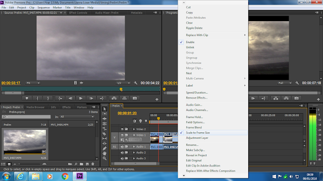


To create a Time Lapse I had to increase the frame rate per second to help increase the speed of the shot. I first selected the clip and right click it. I then clicked 'Speed/Duration' and changed the speed accordingly.
Also in the option box, we had the option to reverse clips which is required for later sequences.


I also then had to learn how to make the shots black and white for the soldier's scenes and how to increase the contrast. Firstly, I dragged across the 'black and white' effect the 'Brightness & Contrast' from the side box onto my clip in the right box which added the effects. By clicking on 'Effects Controls', I could then alter these accordingly to get the effect I wanted.


Saturday, 19 March 2016

First Edit

Above is our first edit from our shoot, to do this we used Photoshop. We decided to stick to the design of our plan and have made the gun black and white but kept the flowers in colour to reflect the clear and powerful message of war and peace which is the theme of our music video, and also to enable the design to remain simple. This edit is only the first attempt and we will continue to edit in more detail to create the desired high quality image which we want to use in both our didgipack and magazine advert. 

Gun Photoshoot


As our designs suggest we needed to complete a photoshoot of a gun and flowers for both our digipack and magazine advert. Above are just a few unedited shots from the shoot. We were lucky enough to have been able to borrow the gun for the shoot from a fellow student. We tried to capture as many different angles as possible of the gun, to get a collection of photographs for us to pick the best. We took the photographs in a light area for natural light to provide the lighting for our shoot, we also used a white floor sheet to create the desired white background. We will now edit some of the shots like we planned for our ancillary tasks. 

Planning of Evaluation Questions


Here are some images of our basic plan and first responses to the four evaluation questions. We decided to create a simple plan together so that we could combine our ideas and thoughts onto paper so that we can change and develop our ideas as we come up with new ways of answering the questions. We also thought about possible ways in which we could present each question. We will continue to develop our ideas and go into more depth of the points made above. 

Magazine Advert Draft


Here is our basic draft for our music magazine advert. We decided to sketch out our chosen design before actually making the finished digital product. We made the magazine add look similar to our dig pack front cover, and also to keep the design simple. This is because after comparing CD covers to mag adds it is common for them to both have the same look, e.g. same photograph or text font. We kept to the simple use of black and white as this is what Woodkid does in his own work, but we will use the same image as we planned for our digipack in our magazine advert. However, the difference is that we have now decided to place two flower garlands on the gun rather then the flower bed that we originally designed for our digipack front cover, as we felt that it would be more practical and effective, these flower garlands will appear in colour and will be the only source of colour within both the magazine advert and digipack. We have kept the design simple and have used minimal text to keep the add interesting and eye catching with the large photo of the run taking up the majority of the add. However, we have included all the necessary information, for example the artists name, album name, three of the song titles including our chosen song 'Run Boy Run', a quote from one of the songs which is the real message behind the song an music video, the artists logo of the crossed keys and finally two logos of the Woodkids record labels. We are pleased with our designs as we think it reflects the artist and our interpretation of the song. We will now begin to make  both the digipack and magazine advert, starting of with a photoshoot of the gun. 

Friday, 11 March 2016

Final Finished Music Video


Here is our final finished cut of our music video. We are pleased with the outcome as we have gone through great lengths to achieve this. We made sure to be as ambitious as possible to help us produce the best quality video that we could and we have improved on the accuracy of our cuts as pointed out by our audience feedback. Though we were limited with equipment, we adjusted to it and tried to get the best out of what we had. We found it difficult to export it in high quality, and with our HD camera, this was the best we could get.