Friday, 8 January 2016
'Run Boy Run' Cover Analysis
This is the album cover for Woodkid's single 'Run Boy Run'. Like the album cover for 'The Golden Age', this cover is very plain in black and white but still creates a rather dramatic impact as the contrast helps it to stand out, drawing the audience's attention. The text is large and bold as it stands out against the black. Again Woodkid's albums have had white text on a black background which helps draw attention to the important information. The audience is also not distracted by exotic fonts- the font is plain, probably 'Times New Roman', which helps them to appreciate the album art.
For this cover 'Woodkid's name was not added. This gives the audience a feeling of community as fans of Woodkid wouldn't require a title claiming who had written this song, but would buy the single as they enjoy the song from the album 'The Golden Age'.
The keys have also been added onto the single as they link the three 'Golden Age' songs together as they represent Woodkid's journey to adulthood.
I also like the album art as it links back to the music video, showing the young boy in the video running with his Viking attire, reading to battle the world. I like how the image is presented to look like a marble statue, like he's honouring his past and youth- especially as this song is about his escape from home out into the big world, I feel that this moment in his life means a great deal to him.
Location Report -Bodiam Castle
We will be using Bodiam Castle for one of our scenes. We chose this castle in particular as we felt that it had a calm peaceful vibe to it which is necessary for the 'peace' character, as this enables us to create the contrast between the two characters, with the darkness and the light. Bodiam castle has a fairy tale feel to it as it is your typical castle with a mote, which means we will be able to get some interesting shots around the mote and bridge and also from within the castle. The castle towers will also allow us to get some high angle shots from above. The images were taken on a visit to Bodiam castle earlier in the course as we started to think about possible places to film very early. We tried to include as many different shots as possible to show the location off and also to show some areas which we will be filming.
In this image you can see the bridge leading over to the castle. This shot is very effective as it has a 'powerful' feel to it as it not only establishes the location but also shows of the castles beauty. We will be using this shot in our film as we feel it will be very effective, therefore we will be going on location very earlier to get the clear view of the castle as that particular spot is very popular and we need to have a shot without other visitors in the frame.
Shooting Timeline
Here is our shooting Timeline, which we created to help us get our basic ideas down and to help understand the timing of the song and what will appear when. We split the song into sections in terms of when the songs beat changes, for example each verse and drum sequences. We put down a rough example of what will happen in each section and also the locations we will be using for that scene. We will then be using this timeline to help us plan in more detail for each shot, which we will decide by listening to the beat of the song.
Treatment
We are doing the song 'Run Boy Run' by Woodkid, we chose this because the lyrics are open and allow us to fit our theme to match them.
Our idea is to show a soldier stop fighting for a war and join peace. The song will be begin, focusing on the soldier in a castle, as he begins to realise that this world is not meant for him. He runs from the castle out into the world. We will then introduce our character, Peace, who runs to the soldiers rescue. Throughout the song, we will show the journey of the two as they run to meet each other. We will include animals to represent them, such as dogs and horses. There will be a dog to represent each character and Peace will ride out with a horse to find the soldier. The characters will meet near the end of the song and we will use multiple shots of nice scenery and repeat shots to represent them telling each other their stories. They will then come to an understanding as she brings colour to his world, throwing powdered paint at each other.
The soldier will be shot in black and white, like all Woodkid's music videos, to show inner darkness and negative emotions. This will contrast with the colour in Peace's shots, which make her seem vibrant in comparison.
Our idea is to show a soldier stop fighting for a war and join peace. The song will be begin, focusing on the soldier in a castle, as he begins to realise that this world is not meant for him. He runs from the castle out into the world. We will then introduce our character, Peace, who runs to the soldiers rescue. Throughout the song, we will show the journey of the two as they run to meet each other. We will include animals to represent them, such as dogs and horses. There will be a dog to represent each character and Peace will ride out with a horse to find the soldier. The characters will meet near the end of the song and we will use multiple shots of nice scenery and repeat shots to represent them telling each other their stories. They will then come to an understanding as she brings colour to his world, throwing powdered paint at each other.
The soldier will be shot in black and white, like all Woodkid's music videos, to show inner darkness and negative emotions. This will contrast with the colour in Peace's shots, which make her seem vibrant in comparison.
Thursday, 7 January 2016
Woodkid CD Cover Analysis
Above is the album cover for Woodkids album 'The Golden Age', which features our chosen song 'Run Boy Run'. The album cover is rather simple as it has a plain feel to it. This is because there is no use of colour and the choice of black and white is not only effective but also links back to his music videos, as Woodkid only uses black and white in all his music videos, for example 'Run Boy Run' and 'Iron'. The chose of the white text on the black box almost looks like a sticker, and the contrast between dark and light really makes the important information stand out. The information on the front is basic and shows the bear minimum which is the name of the artist, the album name and the name of three of his singles that are included on the album. The underlining of the artist name divides the text up and also draws attention to the text.
The use of the mask type sculpture which takes up the majority of the front cover could almost be a 'self portrait'. This is because it could be said that the sculpture is showing the artists emotions and reflects his life which shows that the album is about him. The pin type spikes that are in the mask could be taken in a way which reflecting Woodkid's painful past. The personal touch that this CD cover has continues as the use off the crossed key symbol is a direct link to the artist as the keys are a personal symbol for Woodkid and are also used in his music videos. The overall look and design of the CD cover has a rather technical/metallic feel to it which reflects the more unusual genre of Woodkid's music, which is neofolk. The mask type image which is clearly an art form has been described as being 'minutely detailed and ornate' and is clear that a lot of thought and planning has gone into making this CD cover. This could be because that Woodkid himself is a accomplished visual artist and this album cover clearly reflects this as he employed a professional photographer, Daniel Sannwald. The album cover other then reflecting the artist also reflects the hidden meaning behind the songs and the album name 'The GoldenAge'. This is because the 'artwork implies a new vision of the future and a modernised definition of whats truly golden'.
Above is the back cover from Woodkid's album. As you can see the back also follows the same simple design and continues with the colour theme of black and white. The text is quite unusual as it is not as bold as expected, the text has almost dainty feel to it as the text is fine and uses a grey coloured font rather then black. The key aspects are on the Album cover, for example the track list, barcode, rights to the company and two record label logos and also the two crossed keys symbol is used again, which puts the artists 'stamp' on the cover.
Analysing Woodkids album CD case has helped us understand what the style and theme we need to consider when making our digipack, as we are using Woodkids song 'RunBoyRun'. It is clear that the artist uses many different symbols and hidden meanings in his work which shows that the neofolk genre has quite a niche audience as to understand all the symbols and meanings you need to be a 'true' fan of Woodkid, which makes fans feel like they are part of some sort of group.
Lyric Analysis
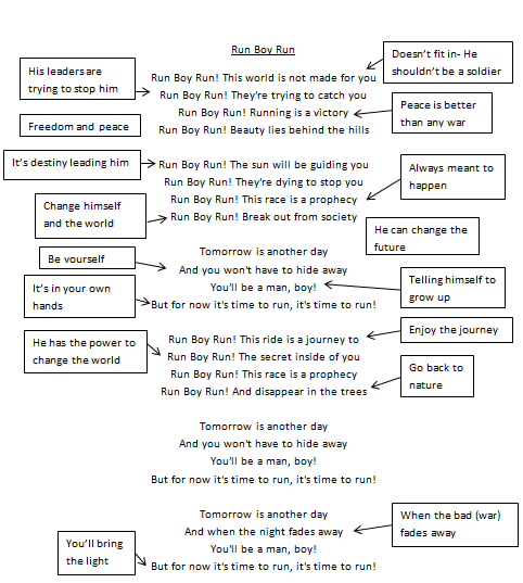
Here is our lyric analysis for our chosen song 'Run Boy Run', we looked at the lyrics and linked them to the theme of war and peace, which is the theme we would like our music video to be about.
Wednesday, 16 December 2015
CD Cover Analysis
Here is the CD cover to James Bay's Debut album 'Chaos And The Calm'. James Bay's music comes under many genres the main being folk rock/ blues genre. This cover is dominated by the large photograph of the artist him self which is quite dull looking with low lighting which creates a dull but also a calm atmosphere which reflects the album title. The photograph isn't particularly eye catching but would attract the fans of James Bay as it has a mid/long shot of the artist, therefore they would be drawn tot he album, also the general mood of the photo almost has a natural feel to it which could reflect the folk style within his music, but also creates a very modern feel to the album cover. The general style is very minimalistic but effective as it reflects the genre of music and also 'keeps things simple' which enables potential buyers to be drawn into the main photograph on the album and perhaps consider the hidden message behind the photograph.
The text font style, colour and size also reflects the calm feel that the album cover is portraying. This is because the font itself is simple and contrasts against the darkness on the image which makes the important information (The artists name and album title) stand out and noticeable. Also, the change in colour of the font separates the name of the artist from the album name, but in a simple way that is not drastic.
Above is the back of the album. The key feature of the back cover is the track list as this shows what songs the album includes and in what order. Also another thing to mention would be the record company logo which features in the left hand corner, and also the barcode for the shops. Like the album cover for 'Years & Years' the CD spine has the name of the artist and also the record label logo on it. The large photo, which provides the background for the back cover, reflects the theme of the front photograph. The photograph could almost be said to reflect the title of the album as an armchair is somewhere to relax and provides a 'calm' atmosphere, however the tatty look of the chair could represent the 'chaos' in the album title 'Chaos And The Calm'.
Subscribe to:
Posts (Atom)