Saturday, 7 May 2016

Evaluation Question 2


Here is our response to the second evaluation question. We decided to do a time lapse of us creating a mind map to explain our points. We tried our best to capture the actual writing however it was very tricky to get the angle right whilst writing. 

Friday, 6 May 2016

Evaluation Question 1


This is our response to evaluation question one, discussing how our music video challenges and conforms to the conventions of it's genre.
We made a film with commentary, using a montage of clips from our music video and other inspirations.

Thursday, 5 May 2016

Final Finished Music Video


Here is our final finished cut of our music video. We are pleased with the outcome as we have gone through great lengths to achieve this. We made sure to be as ambitious as possible to help us produce the best quality music video that we could and we have improved on the accuracy of the cuts as pointed out by our audience feedback. Though we were limited with equipment,we adjusted to it and tried to get the best out of what we had. We found it difficult to export it in high quality, and with the HD camera, this was unfortunately the best we could get it .  

Final Digipack


This is our final Digi-pack for our music video ancillary task. For this design, as in our template, the top will fold over and the disc will be placed on the tunnel image in the top centre. This will create a folding CD case without any plastic casing. As you can see we chose to stick with a black and white theme for the pack by using white backgrounds, black text and black and white images of photographs we took  whilst filming and also screen shots from our actual film, so that there is a obvious link to the video and the digipack. We also chose this theme as it links to the genre characteristics and style of Woodkid's work.

Back Cover of the Digipack


This is the final design for our back cover for our Digi-pack. Like those in our research, it is simple and bold, with typical font and holds all the typical conventions. Such as a bar code  (which we copied from the original CD cover), copy right text, record labels, a list on songs on the album, taken from the album 'The Golden Age' by Woodkid and symbols that are recognisable by fans of Woodkid. This helps the audience feel like they are integrated into the Woodkid fan base, as they will easily recognise his logo- the keys, giving the audience a pleasure of familiarity.
We also then included silhouetted images that link to our music video to help describe our theme of war and peace using specific symbols such as the castles and dog of each character that reflects their difference in personalities. Both characters are included and the soldier was placed with the silhouettes of the graves to link to his scene in the graveyard but also to symbolise the war he's been through.
These images were taken from our own photos and screenshots of our film and edited on Photoshop by rubbing out, cropping and reducing the exposure to turn them into the eye catching symbols on the back.

Front Cover of our Digipack

This is our final design for our front cover of our digipack. It is similar to the Magazine Advert so potential audiences can relate to the CD cover and become familiar with the design and recognise it swiftly as 'Woodkid' production. We included all important information such as the album title, song title, name of the artist, record labels as well as providing a clear and symbolic image that connotes as War and Peace- the overall meaning behind our music video.

After reviewing the front cover again, we realised that the back was just off-white, which didn't match our back cover, so we edited it once more to get a whiter background.


Though the difference is not very clear, it will work better on the Digipack to have the back and front cover matching colours.

Final Magazine Advert

This is our final finished product for our ancillary task of creating a Magazine Advert to advertise the release of the album.
We looked at Woodkid's existing media texts to help inspire our creative decisions in the making of this task. We believe that we have successfully made an effective piece that reflects the conventions of our genre and also apply to our own music video and the message behind it, making it symbolic and simple, like Woodkid's own adverts.


Wednesday, 27 April 2016

What we've changed...

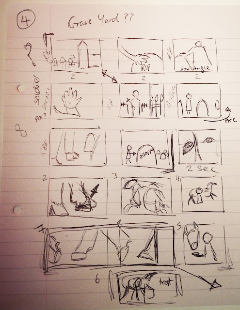
By comparing our Music Video to our initial Storyboard idea, it is clear to see, that we have made several changes and have not stuck to the shots that we planned, but instead used them as a guide, to help us to tell the narrative. At each location, we followed the storyboard, making sure we used as many shots as scripted, but were often inspired by our locations and imagination and therefore improved several shots and included many more other shots that we believed could be effective.

The first major change we made on our storyboard would be the fact that we had to change locations from Upnor Castle to Deal Castle. We then had to adapt our storyboard to this new location. We were able to chose a location that was relatively similar to the original one so we could get the majority of the shots we originally planned. We did not change the storyboard as neither of us had actually been there so we adapted our shots whilst on location which was effective as this enabled us to use the location to our advantage as we were inspired to use certain shots from actually being there and seeing all the areas of the Castle. 


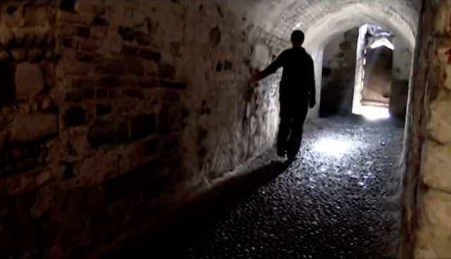
For example, in our storyboard show above we planned on having the soldier character walking through a tunnel with their hand extended backwards. We were still able to achieve this shot despite the location change, above is a screen shot of the result. 


Above is another screenshot. However, this shot was not originally planned and is not on our storyboard. This is because we were inspired to do this shot as whilst on location we noticed the omnious atmosphere created by the dramatic lighting that shone through the tunnel as Janna walked back through the tunnel. So we decided to get a shot of Janna standing in the tunnel with the back lighting creating a dramatic shadow paired with a tilt camera movement at a low angle to really create a powerful shot with the soldier character dominating the shot. 

At all the locations we filmed extra shots and tailored particular shots from our storyboard to the location. We did this at Bodiam Castle as we did many extra shots and we ended up using quite a few of them in our final cut as we felt that they were more effective than the original ones planned. We also left a section in our storyboard for the 'repeated scenes', this is because we felt that these shots could not be planned but should evolve with us as we went through the locations. We also left this section blank as we knew that we would be able to get a lot of extra footage, as we knew this from experience as we know that we can be quite creative with our shots and come up with many more shots ,whilst at the locations, then we originally planned. 


Here is the section of the story board that we left blank for the repeated scene and an example of an extra shot we did at Bodiam Castle and used in the final cut of our music video in the repeated section. In this shot the 'peace' character walks down some steps and out the door. We were inspired to do this shot as we felt that this particular area would create a good location and an effective shot with the lighting which makes the white dress glow and appear almost ghost like with the brightness. 

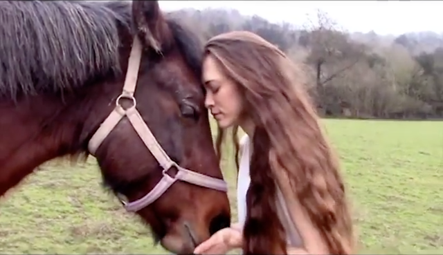
Again when on location to film the scenes with the animals we used our storyboard as guidance as what we needed to capture to portray the right meaning required to create an effective narrative. However, we could not stick completely to the storyboards as we had to adapt to the animals requirements as we could not get them to do exactly what we wanted. However, despite this we were able to get the shots that were needed to tell the narrative and we also improved on some to make them more creative and again got some extra shots that we ended up using in our final cut. 


Above is the original plan on our storyboard for the horse scene. As you can see we originally planned on alternating the beat and having some shots that ran the length of two beats, one of which was of the horses feet in motion. We did get a shot similar to this but whilst editing we decided against this as we had a variety of other shots that we felt were much more effective, we also did not expect to stick to this part of the storyboard as animals are unpradictable so we knew we would have to adapt slightly. Below is an example of one of those extra shots which we used. 


Friday, 22 April 2016

Audience Feedback


After having our final music video reviewed, it was pointed out that to improve, we could have included more close ups or extreme close ups of our characters to suggest emotions during the sequence. For example, the first scenes with Peace, where she looks out from the tower of the castle, where we used shots from behind and the sides. However, we decided against this as we are not actors and we were not confident enough in carrying out the emotion that was required during the sequence. Also, this was pointed out after being at our location, and because we were adventurous with our choice of locations, it would be extremely difficult to reorganise a second trip for a couple close up shots as scenes of the background would have to be included to follow match-on-action.


Gag Reel


This is the gag reel to our A Level Music Video 'Run Boy Run' by Woodkid.
 We did this for own benefit, as we have been in the same group since GCSE and wanted to create a video which combines all our memories as 'The Filmers'.
 We used IMovie to edit this and therefore the cuts are not as accurate to the beat.

Sunday, 3 April 2016

Review of Audience Feedback

Our Final Film was reviewed by another media student who found that he didn't understand the use of the coat throwing scene after the initial paint scene as it did not run in chronological order as the shirt was removed during the paint scene. We understand that this is not in chronological order, however Music Videos aren't often in a Linear-Narrative format but instead use the song as a guide of what scenes are placed where and instead are used, especially in our genre, to portray a message. We felt that this concept helped to emphasise the symbolic meaning of the metaphorical 'release' of the Soldier's inner darkness and finding his peace, just as the jacket is released. This is enhanced by the camouflage colours of the jacket, which is associated with war, reflecting the idea that the Soldier has given up his previous life of hate.
  By cutting between the paint scenes and the coat scene, we enabled the audience to focus on the deeper meaning we were trying to portray. It describes how Peace influences the Soldier to leave the bad behind after she shows him the 'light', as portrayed by the bright 'hippy' peaceful colours.
 In essence, this scene helps to describe the characters progression and change in mindset.


Friday, 1 April 2016

Our Digipack Template


This is the template which we will be using to create our full version of our digipack. We will be inserting our images into the six boxes which will contain photographs from filming and screenshots from our music video.

Thursday, 24 March 2016

Editing on Premiere Pro

For our music video we will be using Adobe Premiere Pro CS6. We have not yet used this software and we had to quickly adapt to this change and learn how to use the more complicated system.

I experimented with our test footage to firstly see if we could create the effect that was required for the shot and secondly to practice using the software and learning how to create basic effects and cut and movie clips.

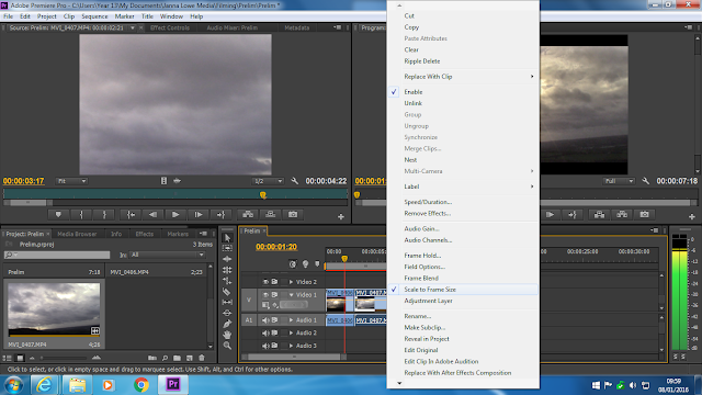
Our first problem with the system was that when we transferred the clip, the video was zoomed in and we couldn't see the full screen. However, I learnt to fix this I had to right click the clip and select 'Scale to Frame Size'.


To create a Time Lapse I had to increase the frame rate per second to help increase the speed of the shot. I first selected the clip and right click it. I then clicked 'Speed/Duration' and changed the speed accordingly.
Also in the option box, we had the option to reverse clips which is required for later sequences.


I also then had to learn how to make the shots black and white for the soldier's scenes and how to increase the contrast. Firstly, I dragged across the 'black and white' effect the 'Brightness & Contrast' from the side box onto my clip in the right box which added the effects. By clicking on 'Effects Controls', I could then alter these accordingly to get the effect I wanted.


Saturday, 19 March 2016

First Edit

Above is our first edit from our shoot, to do this we used Photoshop. We decided to stick to the design of our plan and have made the gun black and white but kept the flowers in colour to reflect the clear and powerful message of war and peace which is the theme of our music video, and also to enable the design to remain simple. This edit is only the first attempt and we will continue to edit in more detail to create the desired high quality image which we want to use in both our didgipack and magazine advert. 

Gun Photoshoot


As our designs suggest we needed to complete a photoshoot of a gun and flowers for both our digipack and magazine advert. Above are just a few unedited shots from the shoot. We were lucky enough to have been able to borrow the gun for the shoot from a fellow student. We tried to capture as many different angles as possible of the gun, to get a collection of photographs for us to pick the best. We took the photographs in a light area for natural light to provide the lighting for our shoot, we also used a white floor sheet to create the desired white background. We will now edit some of the shots like we planned for our ancillary tasks. 

Planning of Evaluation Questions


Here are some images of our basic plan and first responses to the four evaluation questions. We decided to create a simple plan together so that we could combine our ideas and thoughts onto paper so that we can change and develop our ideas as we come up with new ways of answering the questions. We also thought about possible ways in which we could present each question. We will continue to develop our ideas and go into more depth of the points made above. 

Magazine Advert Draft


Here is our basic draft for our music magazine advert. We decided to sketch out our chosen design before actually making the finished digital product. We made the magazine add look similar to our dig pack front cover, and also to keep the design simple. This is because after comparing CD covers to mag adds it is common for them to both have the same look, e.g. same photograph or text font. We kept to the simple use of black and white as this is what Woodkid does in his own work, but we will use the same image as we planned for our digipack in our magazine advert. However, the difference is that we have now decided to place two flower garlands on the gun rather then the flower bed that we originally designed for our digipack front cover, as we felt that it would be more practical and effective, these flower garlands will appear in colour and will be the only source of colour within both the magazine advert and digipack. We have kept the design simple and have used minimal text to keep the add interesting and eye catching with the large photo of the run taking up the majority of the add. However, we have included all the necessary information, for example the artists name, album name, three of the song titles including our chosen song 'Run Boy Run', a quote from one of the songs which is the real message behind the song an music video, the artists logo of the crossed keys and finally two logos of the Woodkids record labels. We are pleased with our designs as we think it reflects the artist and our interpretation of the song. We will now begin to make  both the digipack and magazine advert, starting of with a photoshoot of the gun. 

Friday, 11 March 2016

Final Finished Music Video


Here is our final finished cut of our music video. We are pleased with the outcome as we have gone through great lengths to achieve this. We made sure to be as ambitious as possible to help us produce the best quality video that we could and we have improved on the accuracy of our cuts as pointed out by our audience feedback. Though we were limited with equipment, we adjusted to it and tried to get the best out of what we had. We found it difficult to export it in high quality, and with our HD camera, this was the best we could get.
 

Thursday, 25 February 2016

Filming at Aylesford

We have now finished all the filming for our music video, the final scenes being shot in the Aylesford graveyard. We are very pleased with the way the footage turned out, despite the rain, as we were very inventive and creative with our choice of shot types and movements which will add a variety in our final cut of music video. We also used all the aspects of the location to our advantage and included as much of it as possible in the shots. 

Here are some screen shots of us filming and of the location:


Filming of the finale

We successfully shot the 'final scene' shots at Bluebell Hill, in which the two characters of war and peace finally meet. This included the paint fight scene which we were able to shoot using both the watered down paint and the combination of powdered pain made by us both. We found that the best way to throw the paint was to prepare the pain in some plastic cups ready for use. We are happy with the way the paint scene turned out as we were able to effectively capture the falling of both the powdered pain and paint with the use of a slow motion app downloaded onto one of our films. This was our initial aim for this scene as we wanted to capture the motion of the paint ,which otherwise we would not have been able to without the slow motion app, to create quite a dramatic effect which is need for the ending of our music video to bring the narrative to a 'big finale'. We were however on quite a tight time schedule so we had to unfortunately rush and we did not get all the intended shots, however we do have many shots that we can use as a back up for the missing scenes. 

Here are some screen shots of the paint in motion and the aftermath:


Thursday, 18 February 2016

Final Scene Preparation

For the final scene of our music video we want to have a big paint fight between the two characters as a means of showing the unity of the characters as the soldier 'breaks free' and joins peace. Our initial plan was to use powdered paint which is used in the famous Holi festival, due to its powdered state and vivid colour. However, powdered paint was too expensive for us to buy so we discovered that it can be made using corn starch and food colouring, so we watched some You Tube tutorials. However, we soon discovered after making several batches that making the powdered paint was not only time consuming but also not very effective. Our own home made paint did not have the same vibrance or powdery consistency as real powdered paint so we had to think again to what we could use. We then decided that the only other option for us was to use real paint. We bought a four pack of Crayola washable paint so that it can easily be washed away by the rain. This paint cost us £7 so we decided that we should water the paint down for it to go further. We have now mixed the paint and have some plastic cups that we will poor the paint into as this will be the easiest way for us to throw it. Below are some images of the mixed paint and powdered paint which we made. 


Above is the paint mixed with water, ready for us to film the final scene. 


Above is the blue batch of powdered paint in the drying process, this takes 2-3 days and once dry the paint will be solid and cracks will appear. The pain can then be broken up and finely sieved. 


Here is the final product of the pink and orange batch. 

Viewer Analysis

As we now have our second draft we felt hat it would be a good time to get some feedback on our music videos so far so that it enables us to think about what people have said and try to change and improve anything which may need to be. We made a questionnaire of 8 open questions, which we then printed and handed out to the viewers when they watched the music video so that they could note down anything which they liked or perhaps did not like and also ways they think that we could improve. We gave this questionnaire to 9 of our fellow peers to get a variety of opinions. The results from the questionnaire were mostly positive, and we were given only a thew ideas on how we could further our music video. This questionnaire has helped us as we have now received opinions from people outside of the group and we now know that we are heading in the right direction with our music video. We will also look over points made such as the one about cutting on the beat. Below is the responses made: